Web Design
Magola News Website Design Template
[INTRODUCTION]
About Project
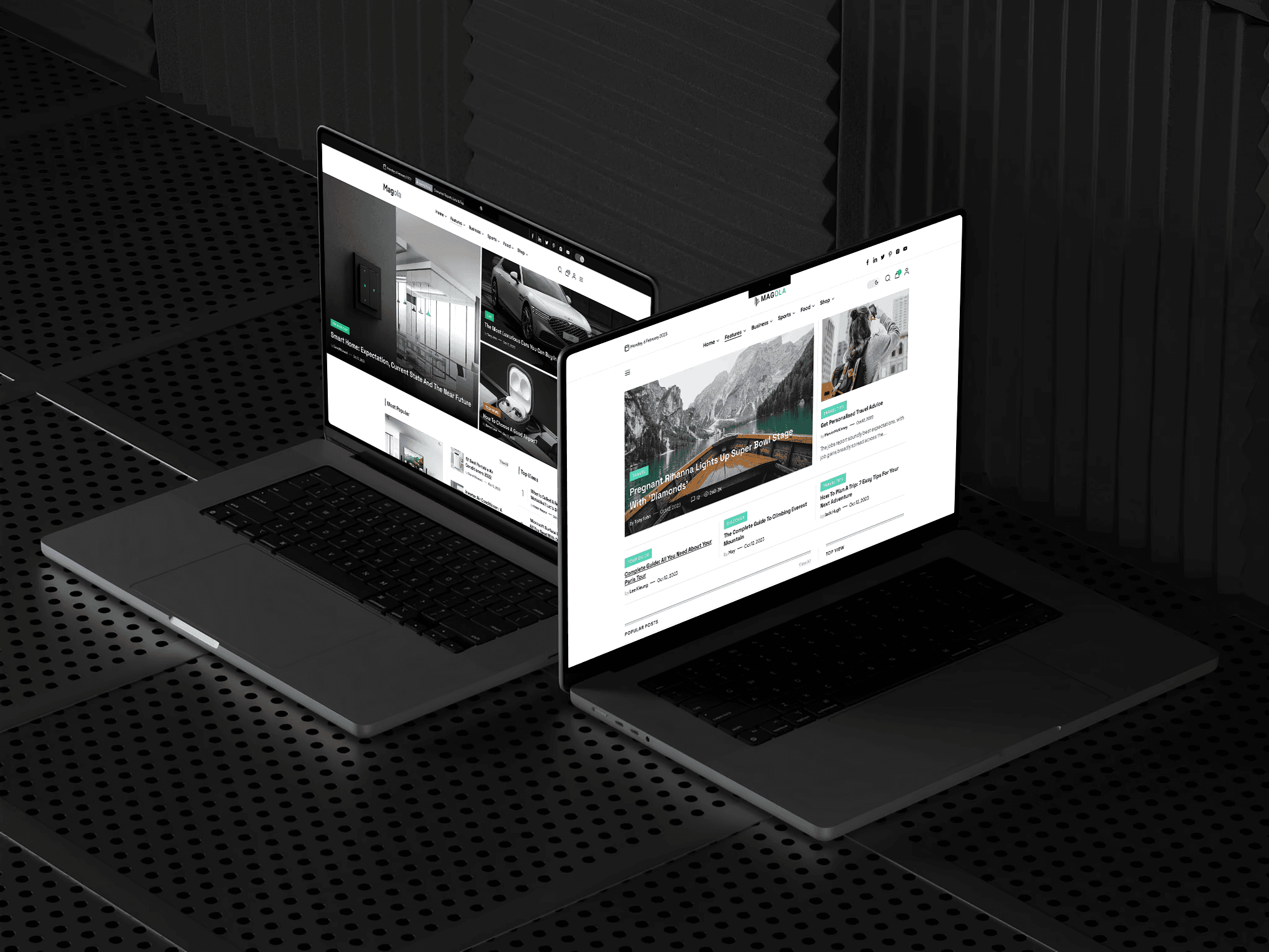
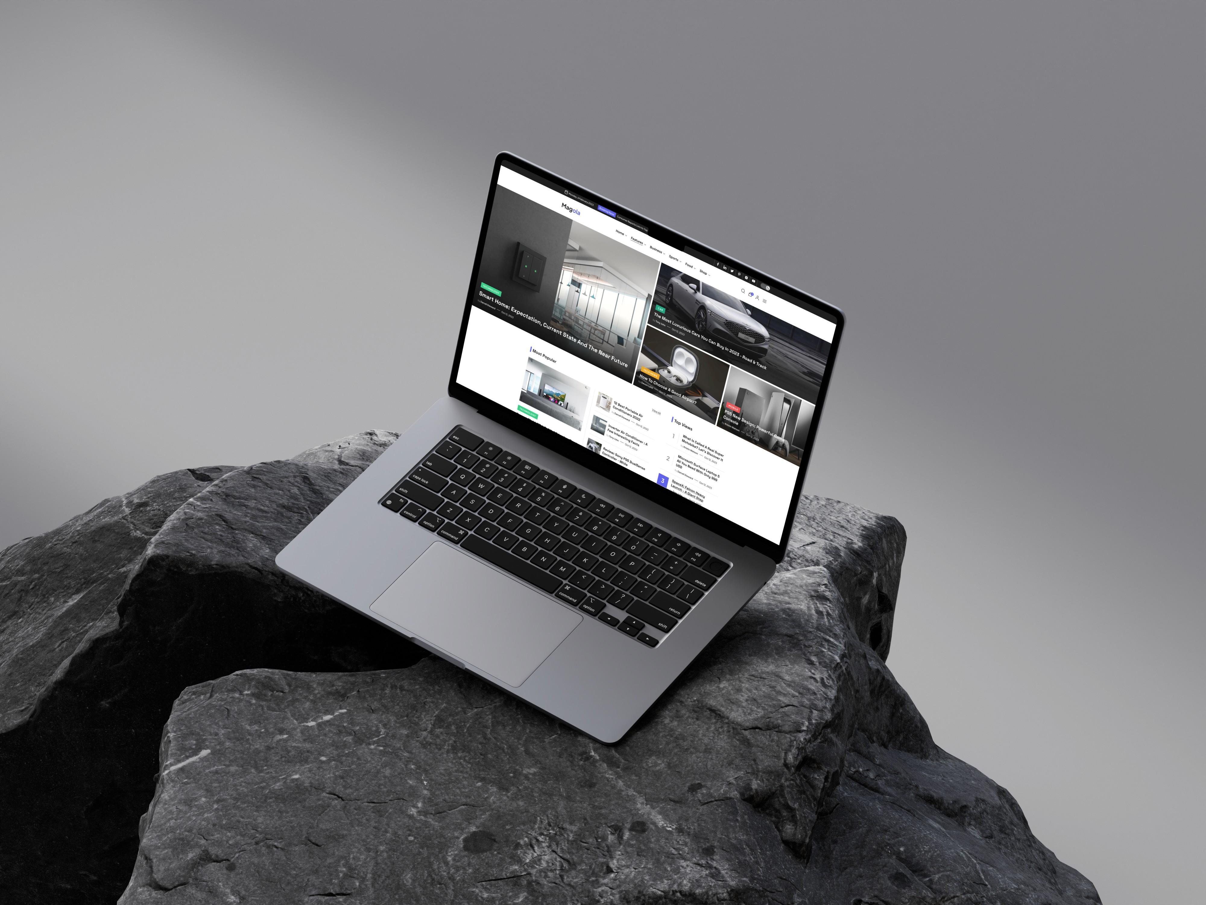
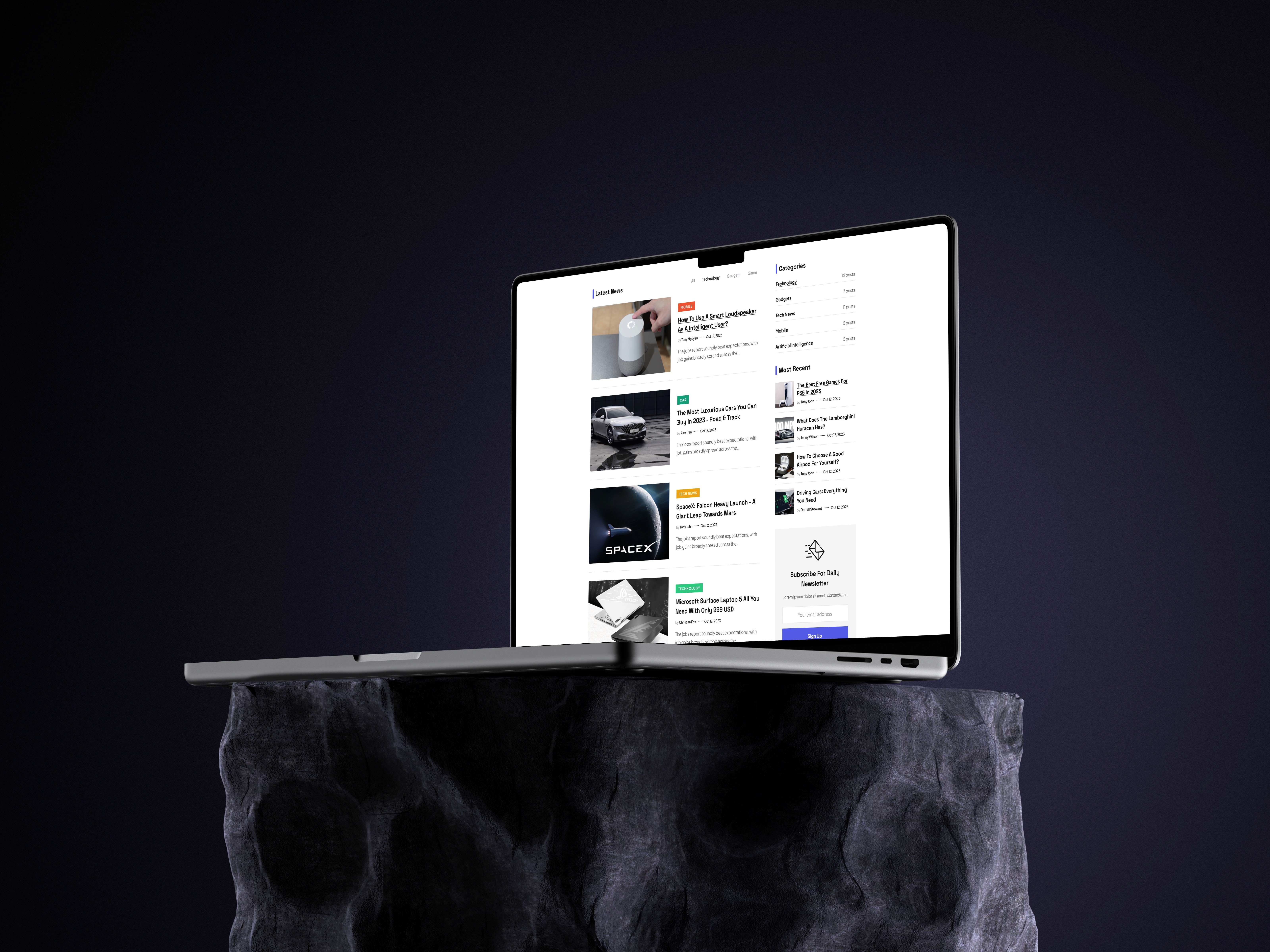
Magola is a versatile news website featuring diverse topics, layouts, and styles. Designed for multi-purpose use, it offers easily customizable components and styles, ensuring flexibility and ease of editing for any project.
[DESCRIPTION]
My Approach
This News Website is thoughtfully designed to deliver diverse content in a clear, engaging, and well-organized way. My approach prioritizes a flexible layout system that can adapt to a variety of topics—from breaking news to lifestyle, sports, and technology—while maintaining a consistent, intuitive reading experience. Every element, from typography to grid structure and visual hierarchy, is carefully crafted to present information accessibly and keep readers engaged across sections.
Vision and Innovation
The vision behind this news platform is to redefine how users consume diverse information online. Rather than being a simple content aggregator, the site aims to be a dynamic, trustworthy destination where readers can easily discover, browse, and dive into stories that matter to them. By combining varied layout styles, strong editorial design principles, and modern UI patterns, it offers an experience that feels both authoritative and approachable, supporting credibility while catering to a wide audience.
User Centric Design
At its core, the news website is built to support reader habits and expectations, making it easy to navigate across categories and discover new content effortlessly. Carefully planned menus, smart filtering, and consistent design patterns help users find stories quickly, while diverse layouts accommodate everything from concise headlines to long-form features. Emphasis on readability, clean spacing, and visual balance ensures an enjoyable, frictionless experience no matter the subject matter.
Accessibility and Optimization
The website is carefully optimized for accessibility (A11y), ensuring readers of all abilities can comfortably consume content. This includes logical heading structures, accessible navigation, clear color contrast, and keyboard- and screen-reader-friendly interactions. In addition, the site follows modern best practices for SEO and performance, with responsive design across devices, fast load times, and well-structured metadata—all contributing to broader reach, higher visibility, and a strong, professional online presence.